

The Advertising Practices Behind NASA Mission Patches
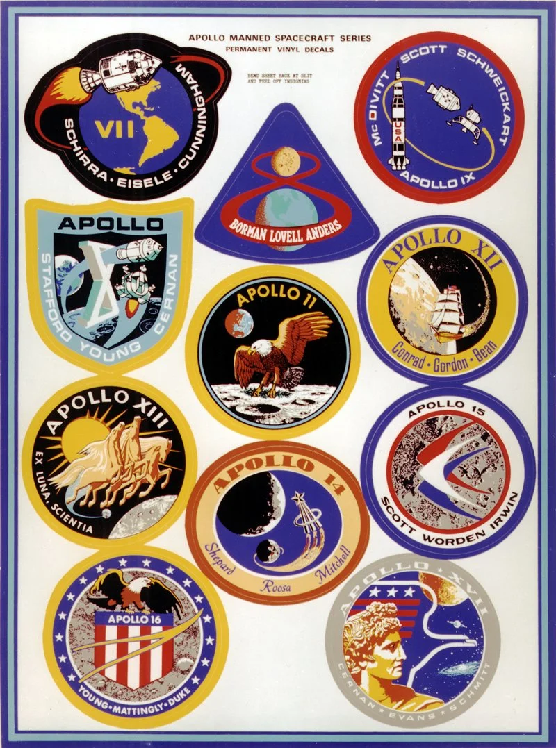
Image Courtesy: NASA
The National Aeronautics and Space Administration’s logotype is well known in the United States, and its design consistency is attributed to the detailed Graphics Standards Manual created in the 1970s. It outlines the various ways the logotype can and can’t be used, but NASA’s infamous mission patches have more design freedom. A NASA mission patch is typically created before a mission to be worn by the astronauts and contains images that relate to the mission’s goals and spacecraft. The unique looks of these mission patches have become individualized symbols for space exploration and an outlet for NASA to share its goals for each mission.
Whether it’s the Apollo 11 patch with a bald eagle holding an olive branch landing on the Moon or the classic Space Shuttle patches with the featured spacecraft at the center, NASA’s patches are each distinctive and packed with meaning. While viewers can readily interpret the symbolism in some patches (the Apollo 11 patch was not very subtle for the first mission where humans walked on the Moon), others are a bit harder to discern, such as the Skylab 3 patch with its imagery that is seemingly not space related. That does not mean each design element was placed there without purpose.
Take the newest Artemis I patch, with red and blue lines sweeping upward into space. According to NASA, the full moon symbolizes the dedication of everyone involved, and even the border color was chosen to represent the Orion spacecraft, which is attached to the rocket for Artemis I and will house the astronauts. For all of the mission patches, the art and copy is meticulously decided upon by the astronauts and designers who work on it, according to lead graphic designer at the Johnson Space Center Sean Collins in the podcast Houston We Have a Podcast.
In the podcast, Collins talks about his experiences in creating NASA mission patches and says the process begins with conceptualization. Mission astronauts and designers collaborate to decide upon symbols and images that best represent the goals of the mission and what should be written on the patch. Collins said at times the astronauts request for hidden details such as their “kids’ initials” and “joke names” for the astronaut candidates. Then, a designer draws a patch design (nowadays on computer programs such as Adobe Illustrator) and a variety of people involved with the mission review it. At this stage of the process, the design often changes until everyone agrees on a final design. Finally, the last step is to send the design to companies that stitch the physical mission patches.
The mission patches draw viewers in with eye-catching elements that visualize each mission’s goals and communicate the excitement of each space expedition. Additionally, astronauts often wear them on their uniforms (as seen on Neil Armstrong’s space suit) and the patches honor the hard work and dedication of everyone who worked on the mission.
Easily recognizable, the patches are synonymous with NASA’s missions, and NASA’s identity, throughout the past decades. The tradition of mission patches has become an engaging and informative outlet for NASA to remind the U.S. public of each mission’s goals. With each new mission, the patches will also serve as a place to remind audiences of the organization’s continued pursuits in space exploration.
Nathalie Hoffman